A design system for flavor-aware coffee packaging.
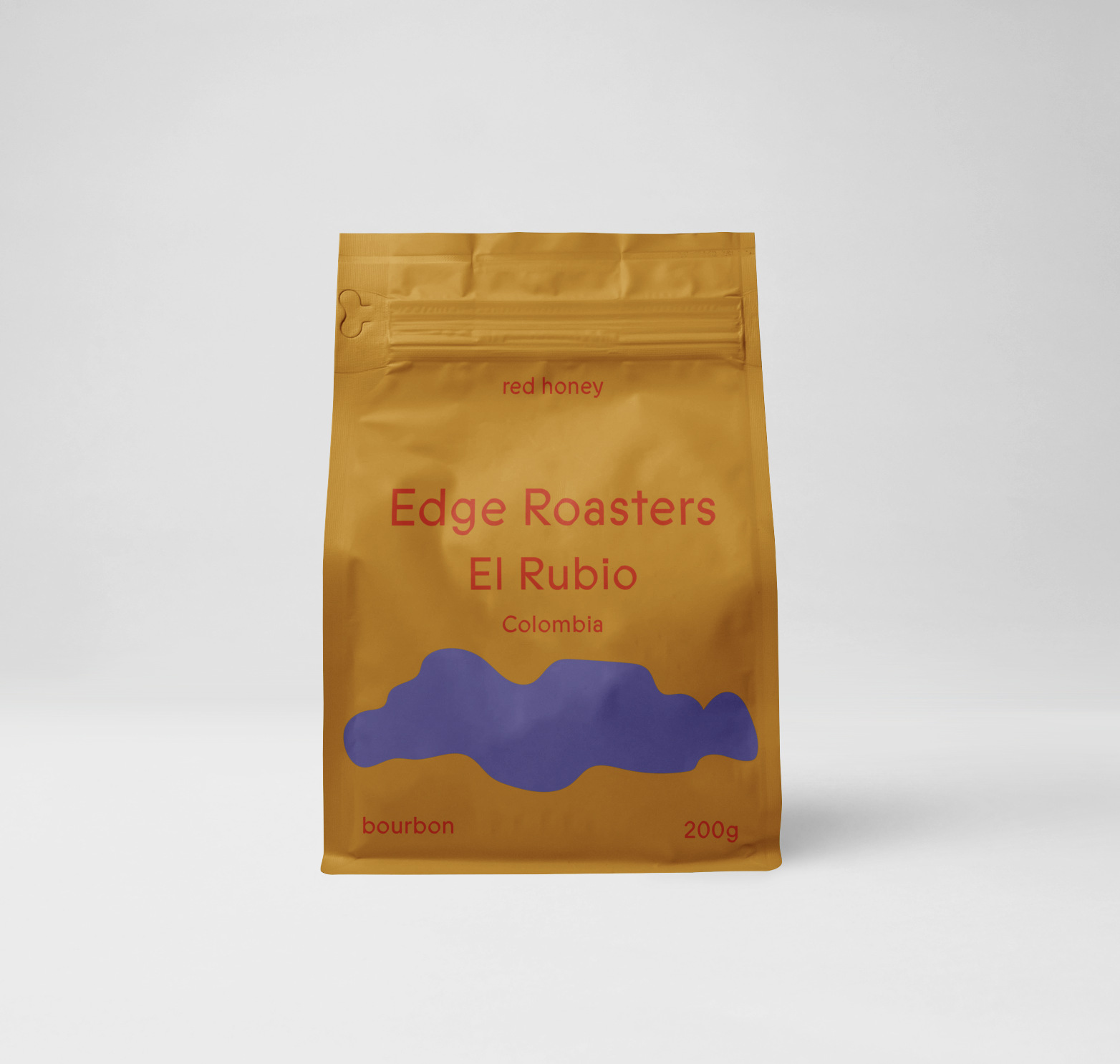
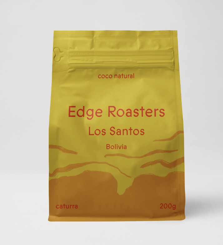
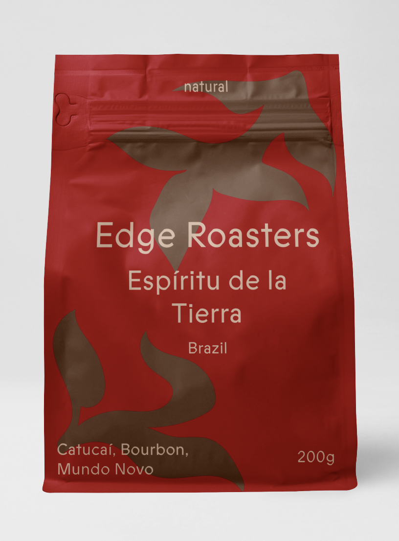
The source of my inspiration was a set of colour coded cards corresponding to coffee flavour notes, used by Mia Fazenda Roastery to help name their coffee beans. I was curious to see if similar Idea can be successfully implemented in packaging design. I decided to create a system for coffee bean packaging design in which the most common flavour notes found in coffee correspond to colours, allowing the colour palette of the packaging itself to communicate the sensory qualities of the product.
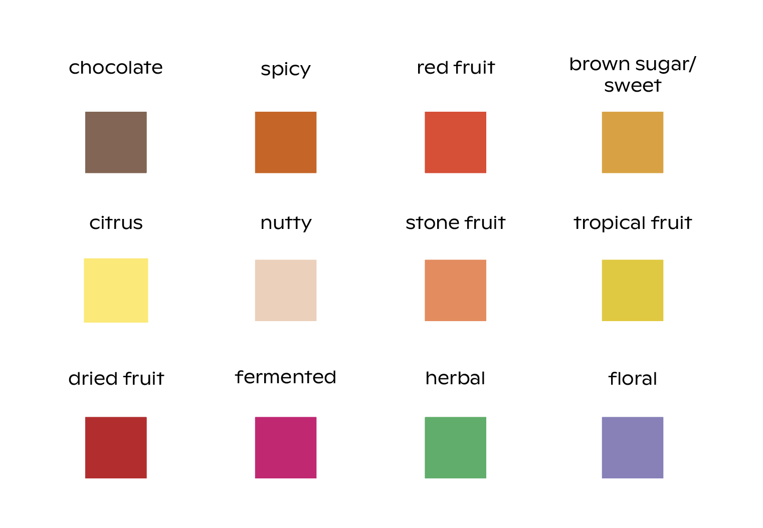
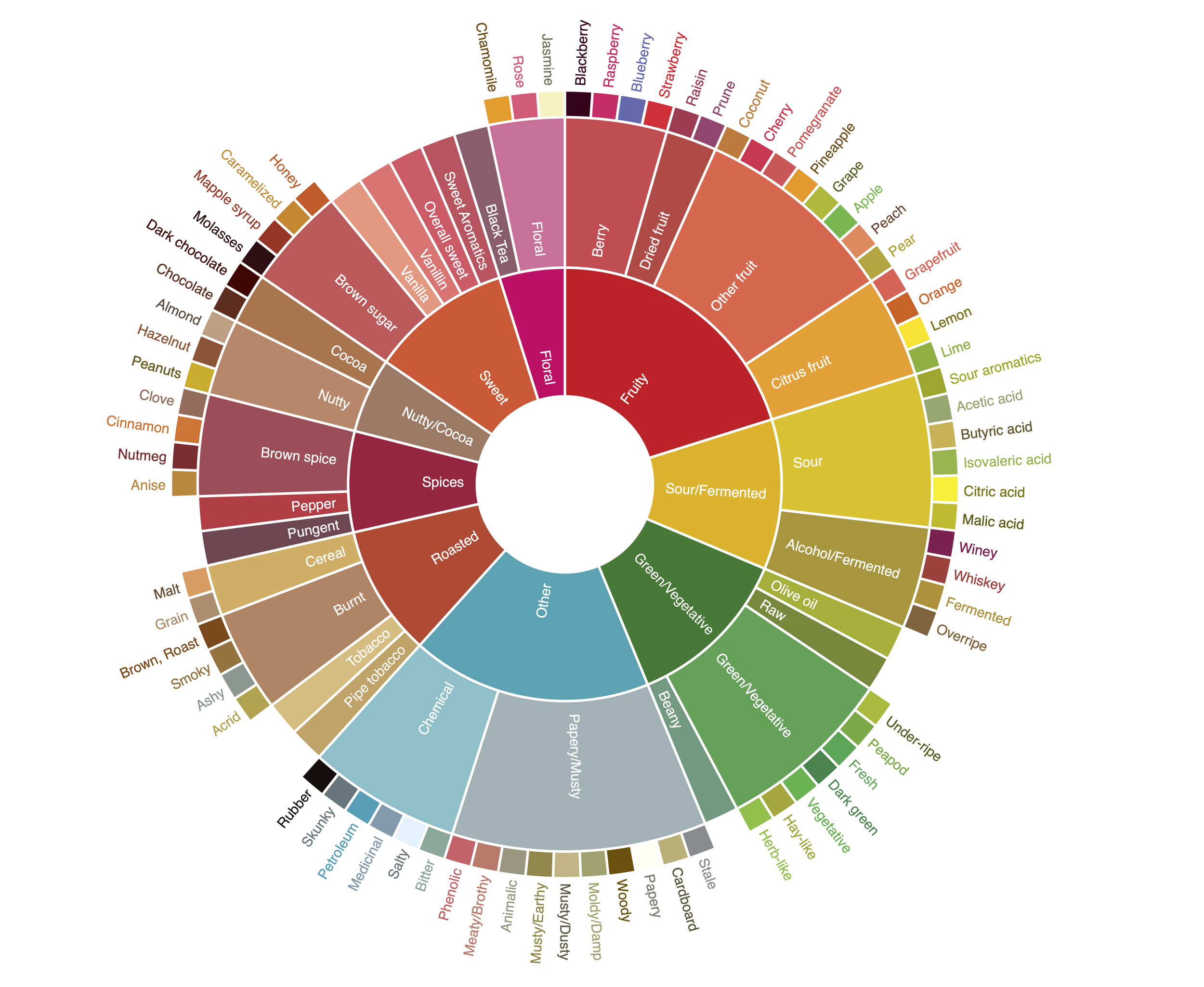
In order to create this system I had to create a colour palette that is varied enough to be able to represent any coffee beans flavour profile, but narrow enough to make sure that the colours work visually together. The coffee flavour chart used in speciality coffee tastings was a key tool that helped me decide on which flavours will be represented in the colour coding system, as well as my own background in speciality coffee. One of the key challenges was finding such shades of colours that intuitively invoke the flavour they represent while remaining distinct enough from the others and visually work with the rest of the colour palette.